Wednesday, August 29, 2012

Quality Score & on-page optimisation

Recently I've been a bit of a Quality Score fanatic, trying to get it as high as possible in my Google based PPC campaigns.

Although this has been a quest to find out the best way of optimising marketing budgets, it's also been a method for understanding just what does and doesn't affect on-page Quality Score.

As you probably know, Quality Score is calculated by Google via a mysterious combination of the advert, keywords used and the page you're directing users to. The more relevant Google thinks these are to each other, the better your QS. The best is 10 and the worst is 1. 

A quick point, if you want to find out your Quality Score, you can by looking at the 'keywords' tab in the 'campaigns' tab in your PPC account. Clicking on the white speech bubble Ad disapproval bubble next to any keyword's status will reveal this calculated figure.

So what on-page attributes makes a difference? Well officially the three important factors affecting landing quality score are: relevant & original content, transparency and navigability (although page speed has been mentioned in several blogs, I'm uncertain about its actual influence in this metric).

Helpfully Google publishes its own advice on how you can optimise your site to make your Adwords efforts more cost effective:
http://support.google.com/adwords/bin/answer.py?hl=en&answer=2404197&from=46675&rd=1
Sunday, August 26, 2012

Still treading lightly with Social Media?

Social Media is everywhere now and is almost become a laughable topic (if you follow the exploits of fake PR person @perfect_siobhan from the tv show TwentyTwelve, then it really is).

To me it seems that nearly everyone in all parts of the business is now talking about "social media", "engagement" and other similar buzzword. It's like they have just learnt how to play Social Media Bullshit Bingo.

It is now part of various job descriptions across organisations and, for a lot of middle managers, if you don't mention it at a job review or interview, then you kind of feel left back in the 20th Century.
Also (finally), pressure is now coming from the top of the corporate tree to "do something social" or (if they are a touch enlightened) to "create a social media strategy".

But hang on. We've had the issue of 'Return on Investment' to deal with for several years now. And in my words from a while back... If you can't justify moving up the levels of the Social Media Maturity Matrix, then don't!

So before you tread heavily with Social, tread lightly but quickly.

Wednesday, August 22, 2012

Is the concept of a page now defunct ?

The page is a metaphor that has existed since the web began. It's a simple device that allows users to navigate around the Internet easily and provides a unique location for each individual piece of content & functionality. Big sites have a lot of pages and even bigger sites have loads, that was the way of the web.

However, there are several current trends that could see the end of the page paradigm as we know it:

1. Parametised search
Have you ever gone to a major ecommerce site (e.g. www.johnlewis.com) and started to browse their catalogue of products? If so, then you may have noticed that the multi-select options, typically shown down the side, allow you to repeatedly filter your choices. In a lot of cases this doesn't refresh the page, but just redisplays the available products in the main viewing area. 

2. Browser address bar prominence
As browsers such as Internet Explorer and Firefox have developed over the years, the actual address bar showing the URL has become less prominent. So much so that for a lot of users, this once obvious feature is now relegated to a small letterbox more useful as a way of seeing if a site is secure (using https and sometimes turning green to depict an extra level of security). Conspiracy theorists may say this is a ploy by the browser makers of reducing our dependency on URLs as a way of navigating the world wide web, however I think it's just a natural move to provide more screen real estate and a sign of how the address bar has become less used (perhaps as we now follow more links from Social sourced?).

3. Constant scrolling 
If you use sites like Twitter and LinkedIn you will notice that you no longer have to click 'next page' or anything similar when you get to the bottom of the page you are on. Instead the next set of tweets, timelines, results, etc. automatically appear. This use of clever results that display more when you need them may seem useful, but what if every site did it? Would you ever need more than one page of results? 
And more to the point.... What if Google and other search engines now did this? 
(For one thing, it would certainly make the client demand of "get me on the first page of Google" far easier to achieve)

Thursday, August 9, 2012

What it means to be Head of Digital

I've had senior online roles for way over a decade now and have met some of the best people in the UK digital industry along the way. This also includes individuals who have been given or earned the title of Head of Digital (as well as having done the role myself).

I therefore thought I would explain what I think the Head of Digital's role encompasses and perhaps give some food for thought on the subject:
Note: it should go without saying that this also refers to a significant extent to other similar titles such as head of online, vp of ecommerce or director of digital and multi-channel.

1. Leadership
First and foremost, any Digital head must possess leadership. Just because online is a relatively new route up the corporate ladder, it doesn't mean we have to ignore one of the key characteristics needed. I will also go as far as saying that they also need to have two specific leadership qualities:
a) To lead change wherever and whenever they can
b) To provide thought leadership (and not just by repeating and re-processing the ideas of others, I mean by having new and original ideas that are innovative and still add business value - and you though this stuff was easy?)

2. Strategic vision
Clarity of what online success looks like and how to get there is key. You don't necessary need an MBA from one of the top business schools, but you need to have the ability to understand where digital is going within your market and what the latest trends are. Also being able to communicate this vision is also really important (as there's no point having a vision if you don't share it).

3. User Experience insight
Its imperative to have an understanding of the key ways to optimise the online customer journey. From minimising bounce rates on the homepage, through to sharpening up the conversion processes across your site. Note: I'm not saying you need to be a leading information architect (and very few Head of Digital people I have met have actually come directly from this route), but an appreciation of the main concepts and having an understanding of when to focus on this is essential.

4. Advanced Digital Marketing skills
Yes, an understanding of the main digital marketing channels is vitally important for this role. However more and more I'm seeing the combination of data and marketing to optimise the customer contact opportunity (and therefore the revenue).

5. A passion for numbers
Sure, there's all the great innovative stuff to look at, but the data you can now pull from your web analytics and associated packages is immense, not including the challenge that comes from 'big data'. If you're a Head of Digital and you're not prepared to stick your nose into a cross-tabulated spreadsheet now and then.... you're probably in the wrong job.

6. Technical expertise
How to split your readership in one easy way..... by insisting that the most senior digitally-orientated person in an organisation has to have some technical nous. But its true!
Note: I'm not stating that the VP of Internet needs to have the same level of technical competence as your Development Manager, but I'm definitely suggesting they should at least be able to confer on a lot of technical issues.

Have I missed anything?

Tuesday, August 7, 2012

Getting ecommerce product images right

We should all know "The 4 P's of Marketing" by now, of: product, placement, price and promotion. However for selling online there's a 5th... Photo

If a picture is supposed to 'paint a thousands words', then a product image on your ecommerce site speaks volumes to your potential buyers (did I mix my metaphors there?).

There are a number of factors to consider with images, including their: size, quality, background, etc. Each can help to contribute to a sale and several of them can further help a customer make the important decision whether to buy or not.

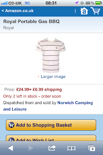
Obviously the most important thing is to show the right image for the actual product, unlike this photo on Amazon I found..... Supposedly for a gas barbecue, but actually showing a white striped polo shirt.


Ooops!

Thursday, August 2, 2012

Everything online is crap - fix it!

I'm going to approach things in a slightly new way from now on and the title of this post might just give it away.

If you make the assumption that every single website that is out there in some way needs fixing, then in my opinion you are on the right track.

I've previously stated my friend Tristan's thought that "if your ecommerce site isn't broken, you're not looking hard enough" and my approach is really a development of that.

Every website in some way needs help.

Here's what i mean by that comment. It is either:

1. Not fully compatible with all browsers
(a moving feast of web standards and evolving interpretations by the different browser makers - with Microsoft being the primary but not exclusive culprit over the years)

2. Not optimised for the user
(Even the most applauded websites have some barriers to their target users being able to complete all their tasks with the minimum of barriers. From eCommerce sites that sacrifice the smoothness of the user journey by trying to place more buying options in front of the potential purchaser, through to content sites like newspapers that interrupt the reader flow to insert advertising)
Note: and before you comment.... Yes, I know there's a commercial driver to both of these examples, where the site owner seeks to maximise the revenue from either sales or advertising, but this balance between revenue and user experience needs constant review to keep it in check.

3. Not optimised for speed and scale.
(It's actually pretty amazing, given only a few years ago we had to wait ages for a single image to come down the digital pipe via a chirping modem, that we now have such bloated websites that nobody has taken time to optimise the code, images and other assets. I've often criticised the flabby weights of major brand home pages and this is only the tip of the iceberg.
Only a decade ago I had to make sure my online production team got the most out of every kilobyte downloaded, now pages of over a megabyte are not uncommon. Have we not learnt anything from those days from around a decade ago? Apparently not!)
Note: And these site owners wonder why their beautiful, newly-built and interactive platform goes down as soon as more than a few visitors come and take a look....

4. A bunch of other reasons I've previously gone into.
(From bad error messaging through to sites that decide to just break for no apparent reason..... the world wide web is awash with mediocrity that the people commissioning, building and testing them should be ashamed of).

But that's enough ranting. Just accepting it is all crap is not the answer. "Be the change you want to see" said Ghandi (allegedly) and this is what we must all do online.

If you manage a site and it is crap, fix it! If you use a site and it doesn't do what you expect, complain. If you try to buy stuff online and the site does everything it can to make it difficult to transact, don't buy anything (but do feel free to give feedback on why you didn't).

We owe it to others and ourselves to improve the online user experience wherever and whenever possible. We need to fix things and fix them fast!